Spreadsheet Project
Spreadsheets and databases are powerful tools for data analysis and presentation. Often thought of as tools for math and science, these programs are equally valuable in any classroom where data is collected. By using spreadsheets to create graphical presentations of data, students can observe trends that otherwise might be overlooked. Below are four examples of how spreadsheets are used in middle school classrooms (Language Arts, Science, Math and Social Studies). Each example uses a different type of graph.
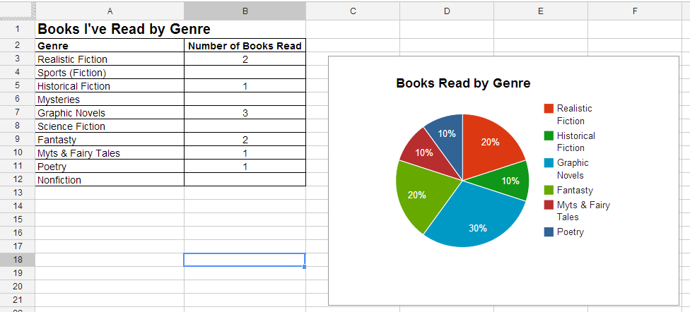
Language Arts: Students are required to read ten books independently throughout the year. To encourage the students to read a variety of genres, they create a spreadsheet to track their selections. A pie graph is used to graphically analyze their book selections. This exercise requires a basic two column spreadsheet (Genre, Number of Books Read).
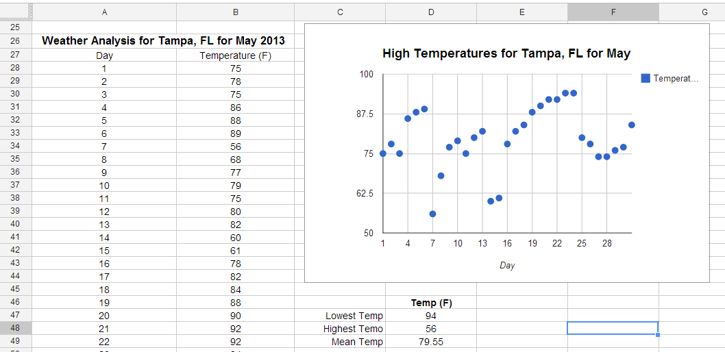
Science: Sixth grade students study weather. This activity has students collect daily high temperatures for one month for any city in the world. The spreadsheet contains two columns (Day, Temperature). Students create a scatter plot for their analysis and then calculate the highest, lowest and mean temperatures. After all data has been collected, students compare their findings with two peers and present explanations as to what factors contribute to the differences/similarities in their data.
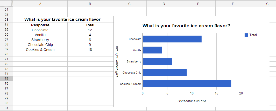
Math: Students create surveys for classmates, families, or friends asking a question of interest such as "What's your favorite ice cream flavor?", "How many pets do you have?" This data is then plotted in a bar graph. Students present their findings to the class. The graph has two columns (Response, Total) representing the person's response, and the total count of all people that gave that response.
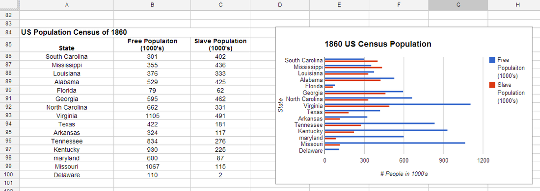
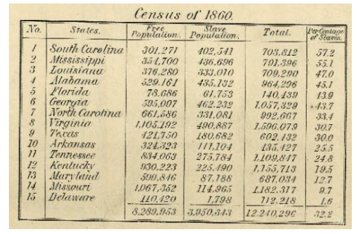
Social Studies: Students use census data to create a spreadsheet that compares the free population versus the slave population of the United States in 1860. This data (State, Free Population, Slave Population) is plotted in a bar graph. Students analyze the data to make observations between north/south populations, and then use this data to explain the relationship between cotton production and slavery (students have maps showing cotton production distribution by state).
Part Two: Using graphs to predict trends.
Topic: Sixth grade math students use graphs to analyze data and make predictions. It is essential for them to understand the relationship between the number of data points and the ability to make accurate predictions based on that data. In this project, students analyze historical stock market data by using Yahoo's financial website.
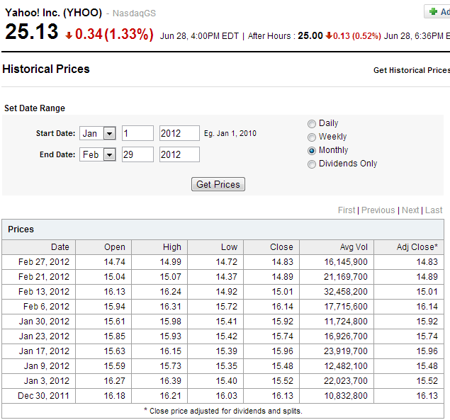
Students will analyze the Yahoo stock (YHOO) for any two month date range of their choice. They will retrieve their data three separate times from Yahoo, each time changing the frequency of the data (monthly, weekly, daily) by using the radio buttons on the Yahoo site. (this makes it easy to copy/paste data into their spreadsheet)
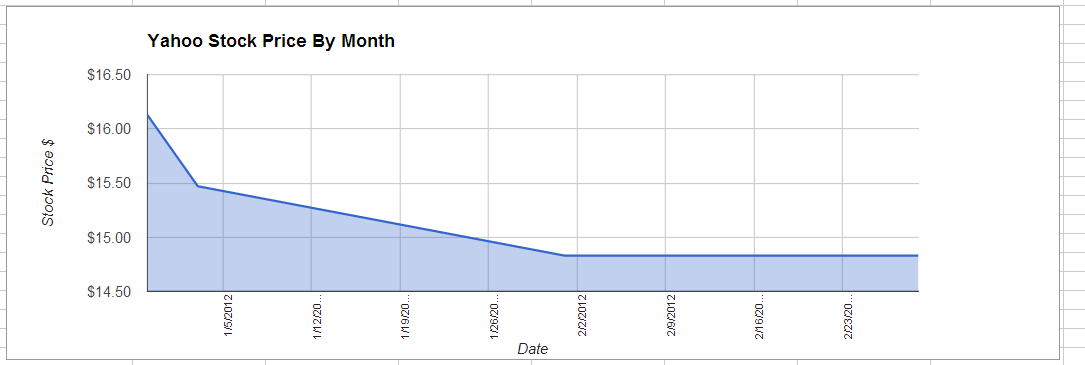
Essential Learning: This activity is aligned with the sixth grade math standards (see below). The focus of the activity is to analyze graphical data and make predictions. Students will create three graphs for this project:
Students will analyze each graph independently to make predictions about the stock's performance, and then they will compare their three graphs to each other to explain how the change in number of data points affected their interpretation.
- Monthly price chart (4 data points)
- Weekly price chart (10 data points)
- Daily price chart (41 data points)
Students will analyze each graph independently to make predictions about the stock's performance, and then they will compare their three graphs to each other to explain how the change in number of data points affected their interpretation.
Data: Students can use the copy/paste functionality to enter data into their spreadsheet from the Yahoo website. They will need three groups of data (one for daily, weekly and monthly data). The following data needs to be recorded for each group.
- Date
- Closing Price (Daily $, Weekly $, Monthly $)
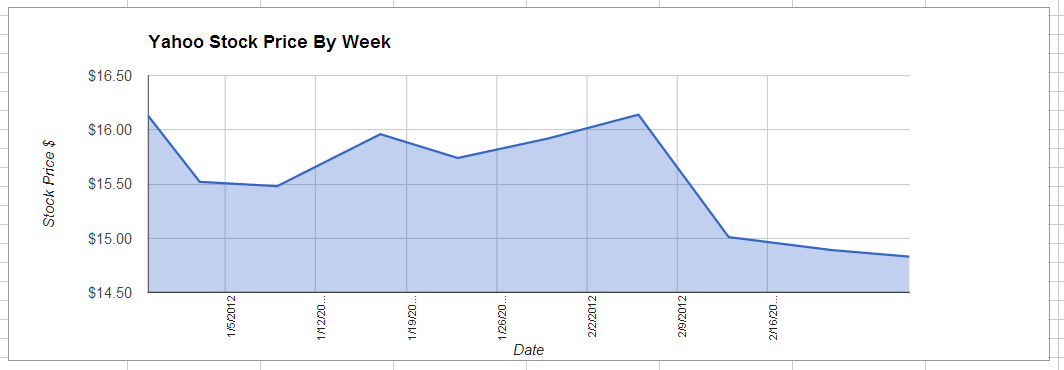
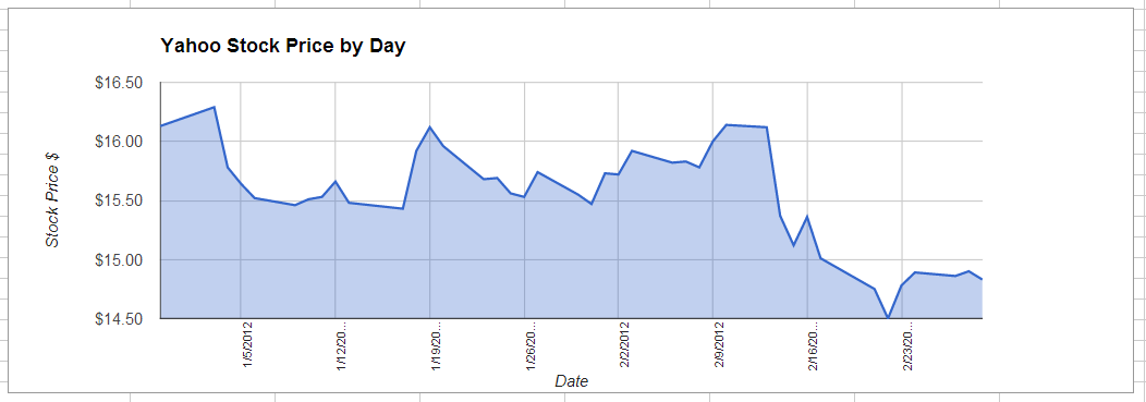
Outcome: Students will study three graphs. Since the students were given their choice of stock and date range, each outcome will be different. Some students may observe that increasing the number of data points may not have changed their analysis. Other students may observe significant differences in their graphs. In this case, the student should identify what opportunities may have been missed if they owned that stock (such as spikes or dips where they could have bought more or sold their stock).
